Design system

Step 01.

The problem

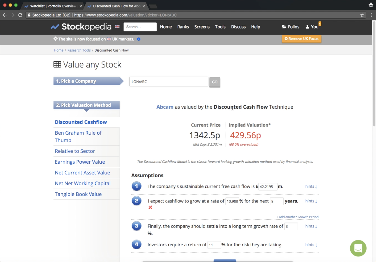
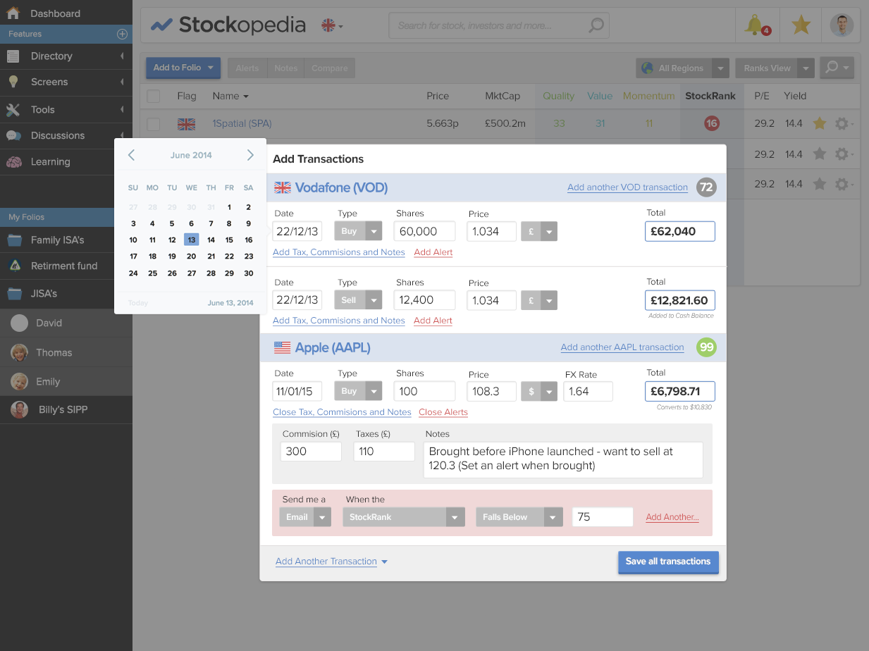
Two versions of the site: The live version of the site and the in-progress redesign had different visual design styles. There were very few design files to reference, as most ideas were implemented directly into code.

Inconsistent design practices: A few Photoshop files had been created for desktop designs, but they lacked any specifications for implementation. Mobile designs were largely overlooked, leading to layouts that broke at lower resolutions. The Bootstrap toolkit was used but customised inconsistently, leading to a disjointed user experience. There were no clear rules or guidelines to ensure components were used consistently.

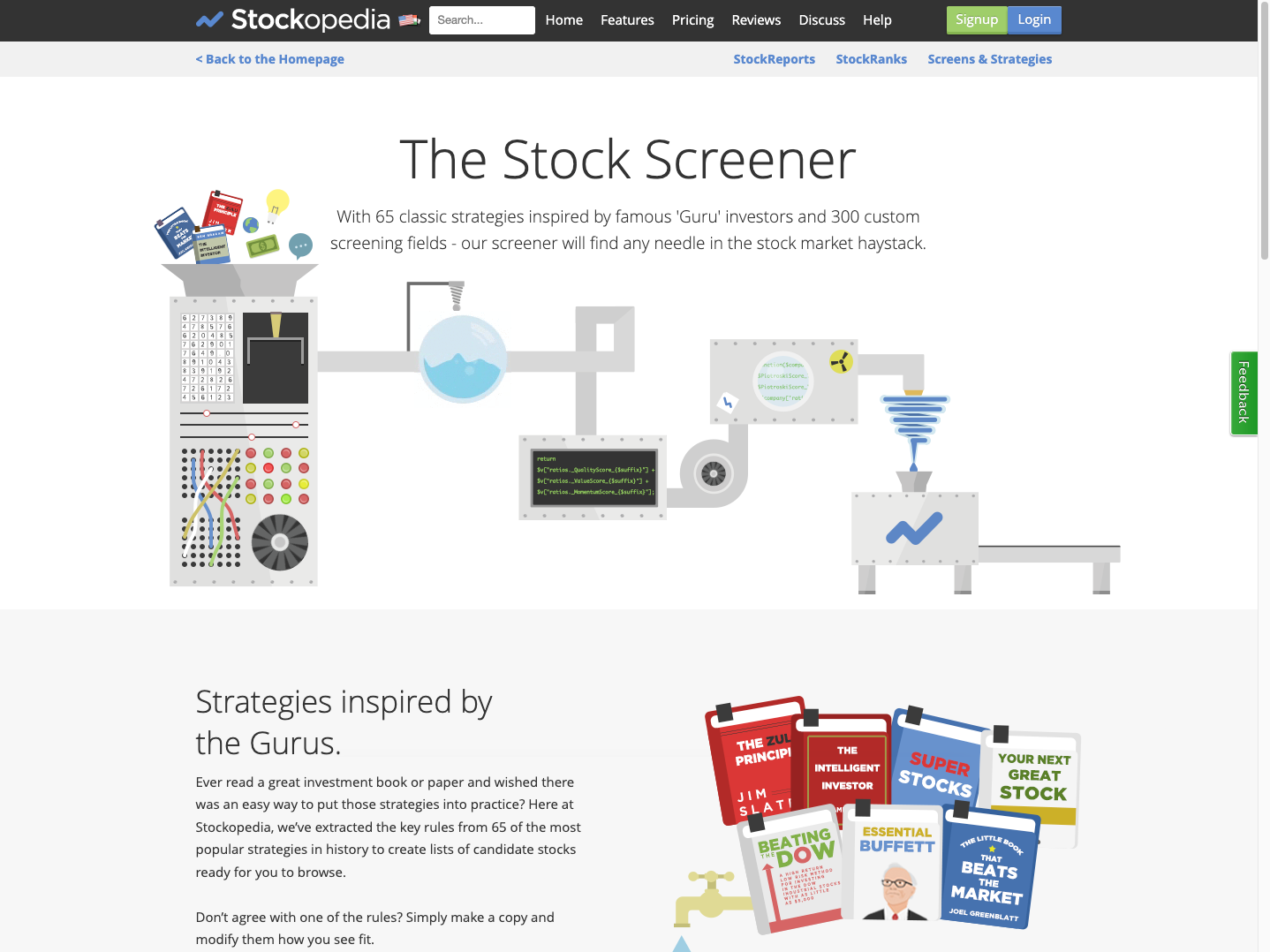
Visual clutter: The interface was overwhelmed by childish graphics and colours, creating a cluttered appearance with low information density. Childish illustrations and animated GIFs were overused in an attempt to convey brand personality. This was inappropriate for a premium financial research tool.

Colour inconsistencies: The same components appeared in variety of colours without a clear rationale as to why, this caused confusion regarding their function. Colour contrast was not considered, making the site difficult to read and inaccessible.

Step 02.

Review existing sites

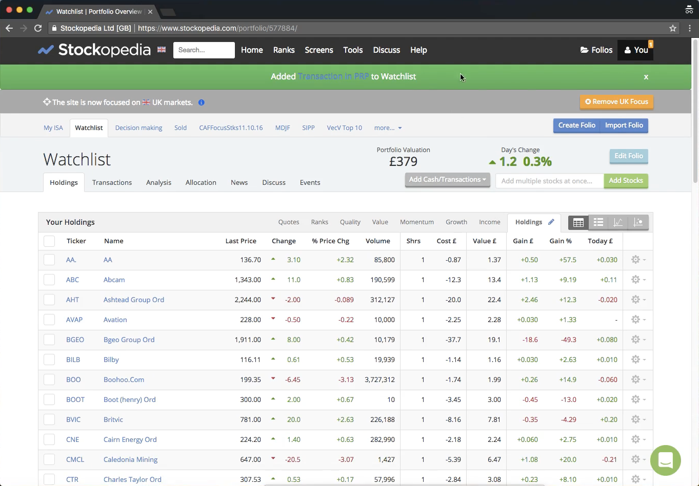
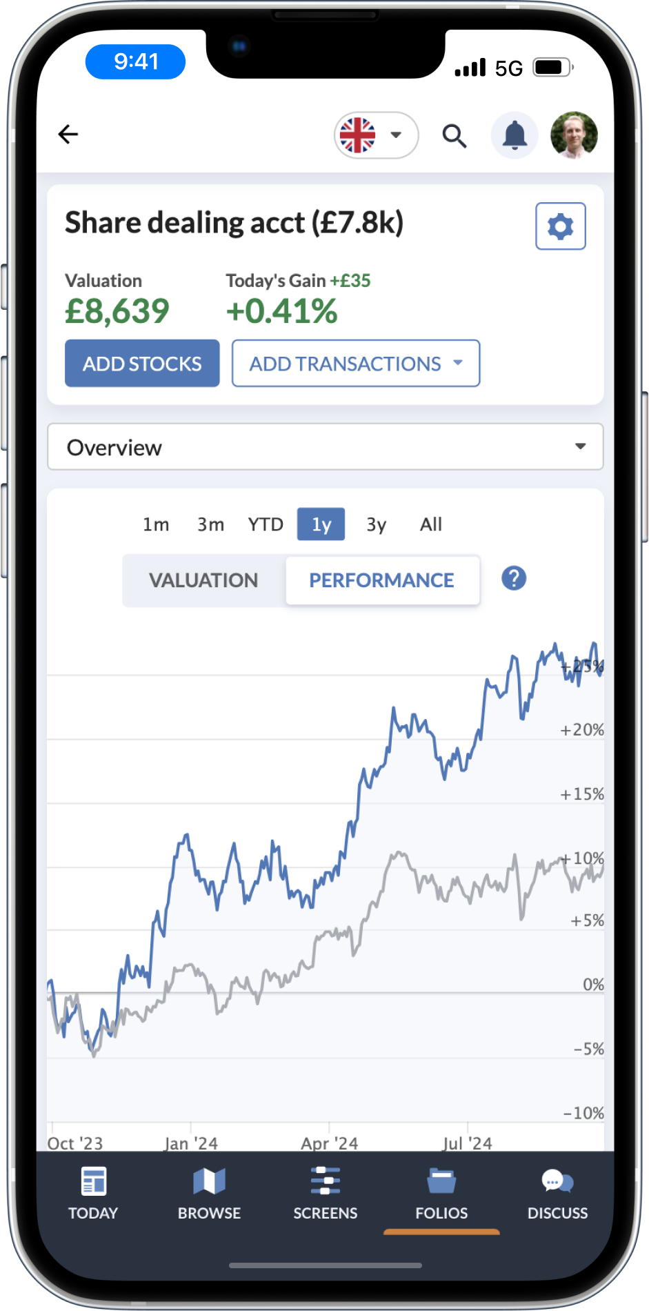
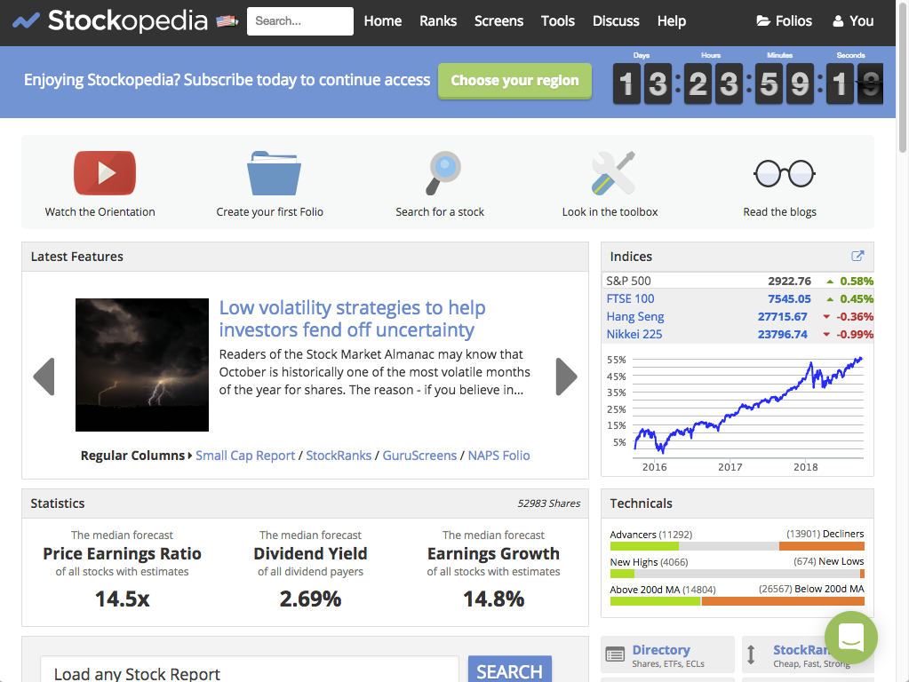
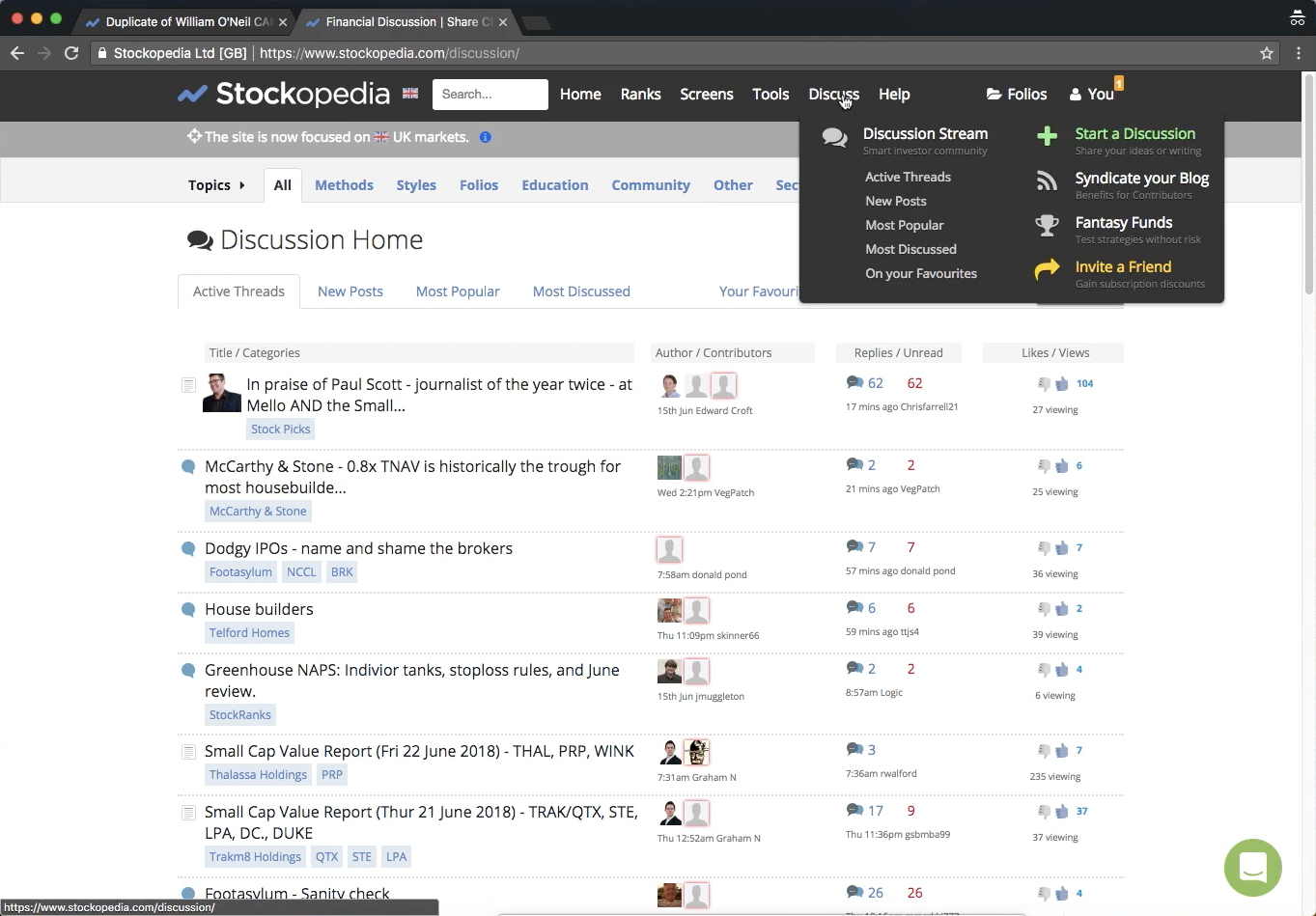
Live site

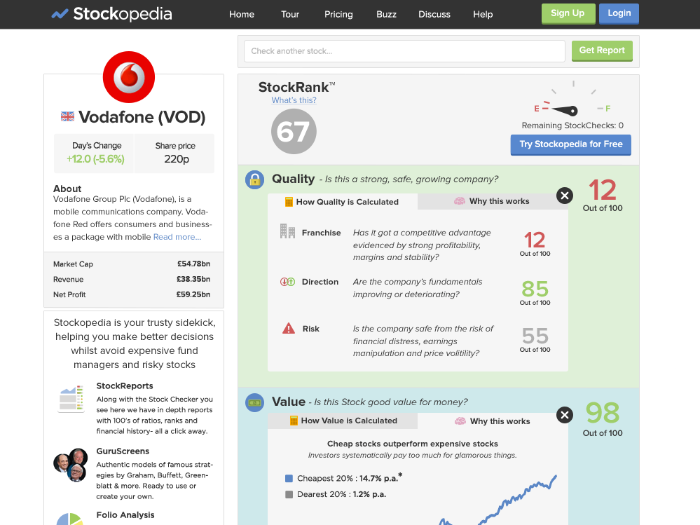
  • The site didn’t work below small desktop resolutions, resulting in awkward horizontal scrolling.
  • The use of colour was inconsistent and contrast ratios didn’t meet W3C guidelines.
  • The interface looked dated and the childish graphics weren’t suitable for the target audience.
  • On a positive note, the logged in experience had good information density on data tables and StockReport pages.
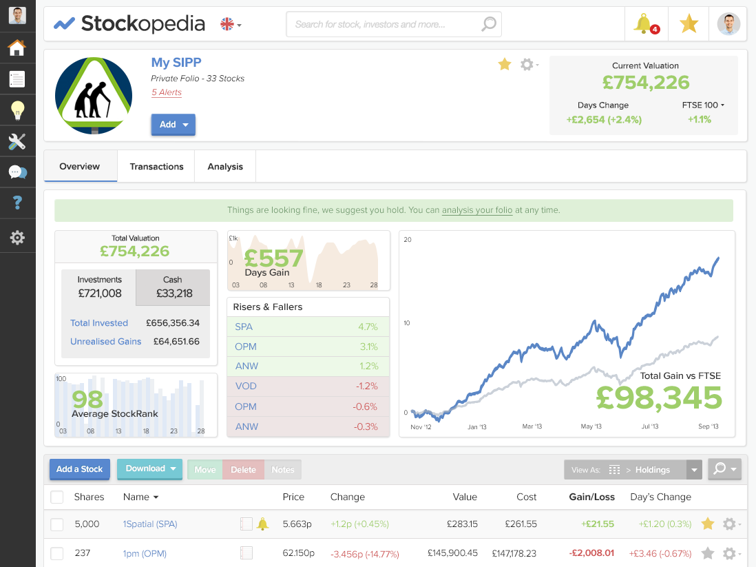
In-flight redesign

  • The team had attempted to create a more modern feel by adding more decorative graphics and colour, but this increased the childish appearance of the product.
  • Pages felt visually cluttered and had very low information density.
  • Colours didn’t meet accessibility contrast requirements, resulting in text and data visualisations that were hard to read.
  • Selected and disabled states were unclear.
  • Pages lacked a clear visual hierarchy or rhythm.
Step 03.

Improving workflows

Process enhancements:

  • From the first project I worked on, all new product increments had high-fidelity design files across several resolutions (1440px, 1024px, 768px, 375px).
  • Initially, I created high-fidelity designs in Sketch, exporting these to Zeplin for file management and developer handover. When I hired a UI Designer, we switched to Figma. It was better suited for designer collaboration and had an inbuilt Developer Mode. Using a single tool also simplified the design process.

Design system implementation:

  • We did one initial release to update some of our basic styles (fonts, colours, etc.). After this, we chose to update components as they were required to reduce risk and not tie up resources for an extended period.
  • New UI elements were documented in the design system, and components were created in Figma. This ensured designs were consistent and increased the efficiency of the design process.
  • The engineering team translated these components into a front-end development tool called StoryBook. The design and front-end teams met fortnightly to review new components and ensure Figma and Storybook were kept in sync.

Step 04.

Design guide

The design system at Stockopedia has evolved into a comprehensive set of guidelines. Below is a small excerpt from the documentation I created for the redesign. Updates to our design system are now handled by our UI designer, while I oversee and review all new components.
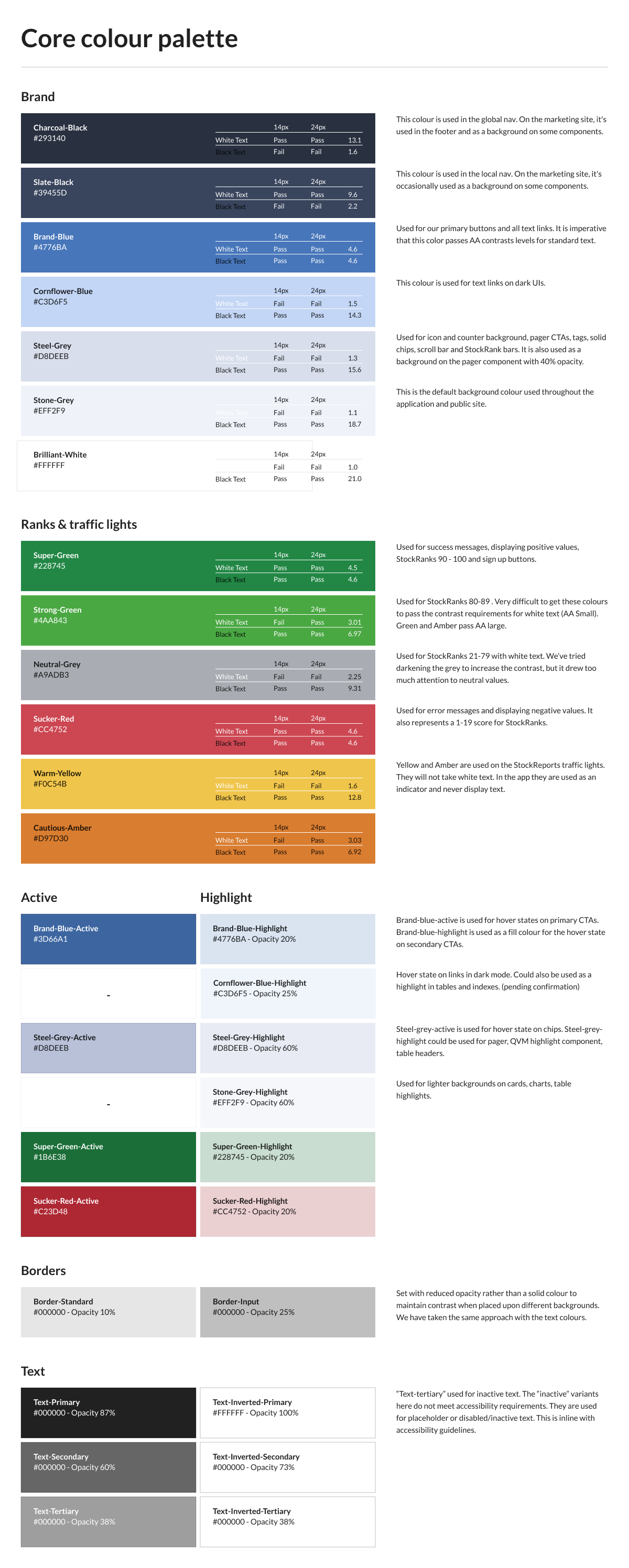
The Stockopedia colour palette, documented as swatch tables with usage rules.
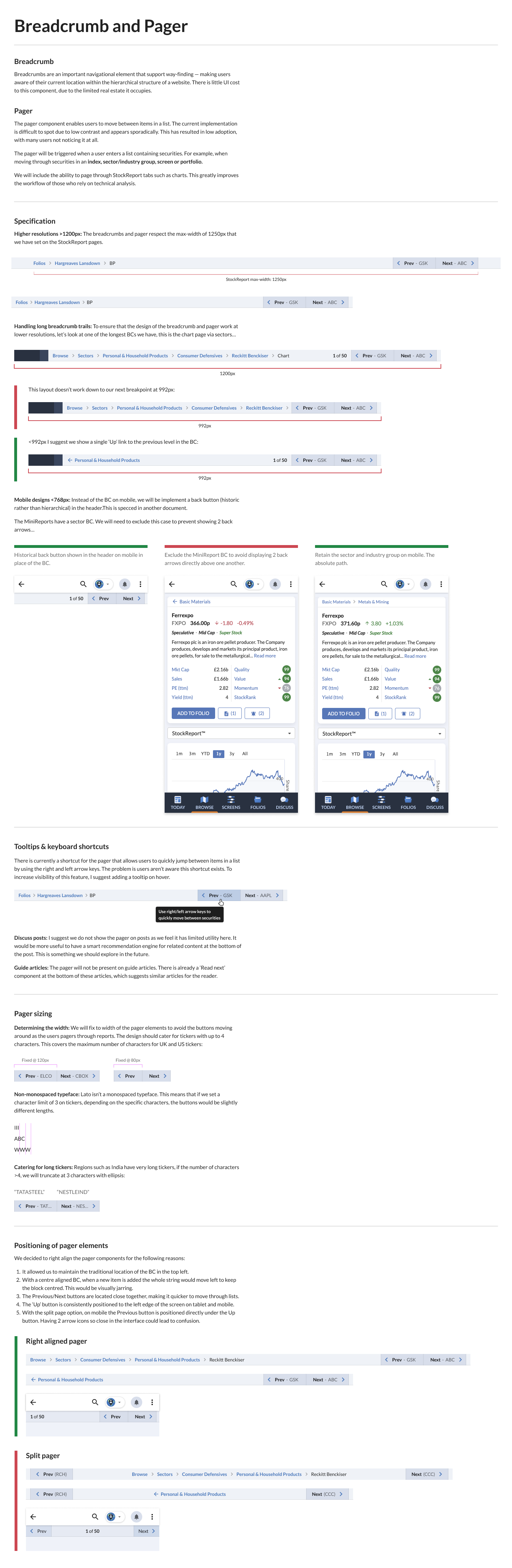
Design system documentation for the breadcrumb and pager components.
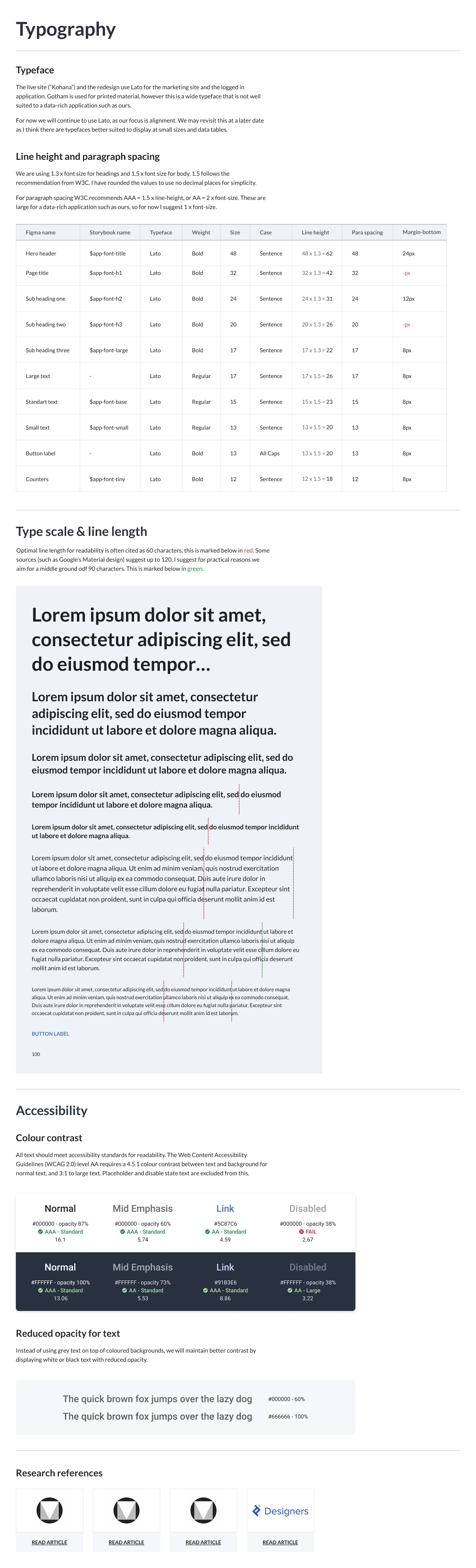
The Stockopedia type scale, documented with sizes and usage.
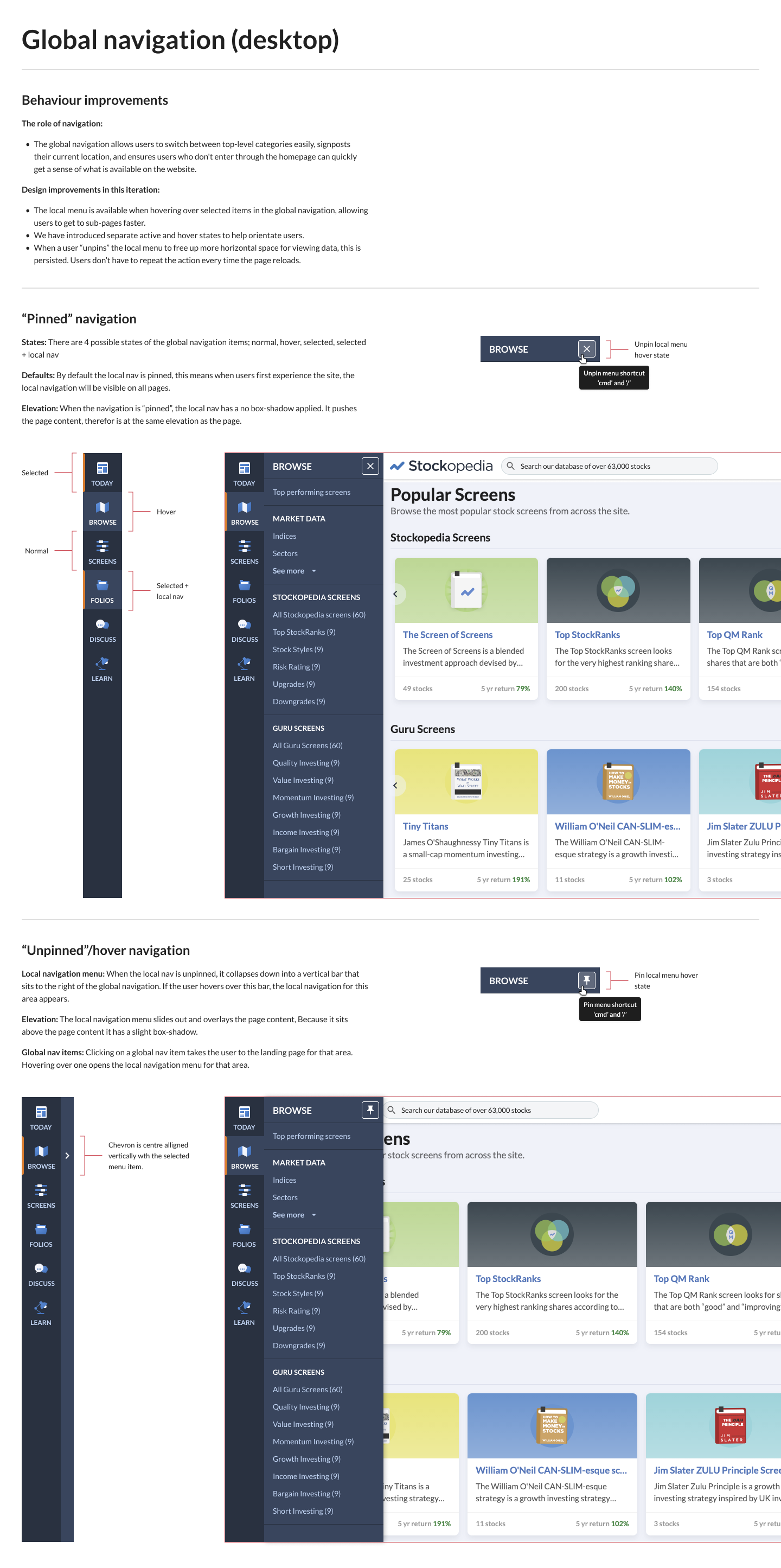
The global navigation component as designed for desktop.

Step 05.

Results

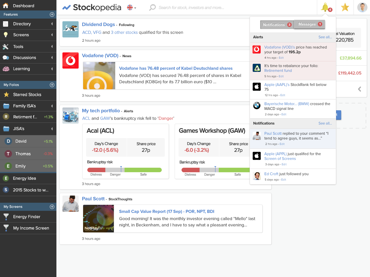
Design Philosophy: As a data-rich financial application, information density and clarity are paramount. Financial markets are inherently noisy and confusing, making it essential for the design to convey a sense of stability and bring key insights directly to the user, rather than requiring them to search for it.

Design System Evolution: While a design system is always a work in progress, the design function has advanced significantly since I joined Stockopedia. Design is now the second most frequently cited positive feedback from promoters completing the NPS survey.

Key Product Differentiator: In a recent product positioning workshop, the business identified “Quality of Design” as one of our key unique attributes. It forms one of the four key value pillars that differentiate us from our competitors.

“The concise display and analysis of vast amounts of information in an easy to interpret layout & interface.”

“I’ve tried other platforms like Bloomberg, but Stockopedia just makes things so much easier to understand and use.”

“Everything is at my fingertips, and I can navigate the tools without difficulty.”
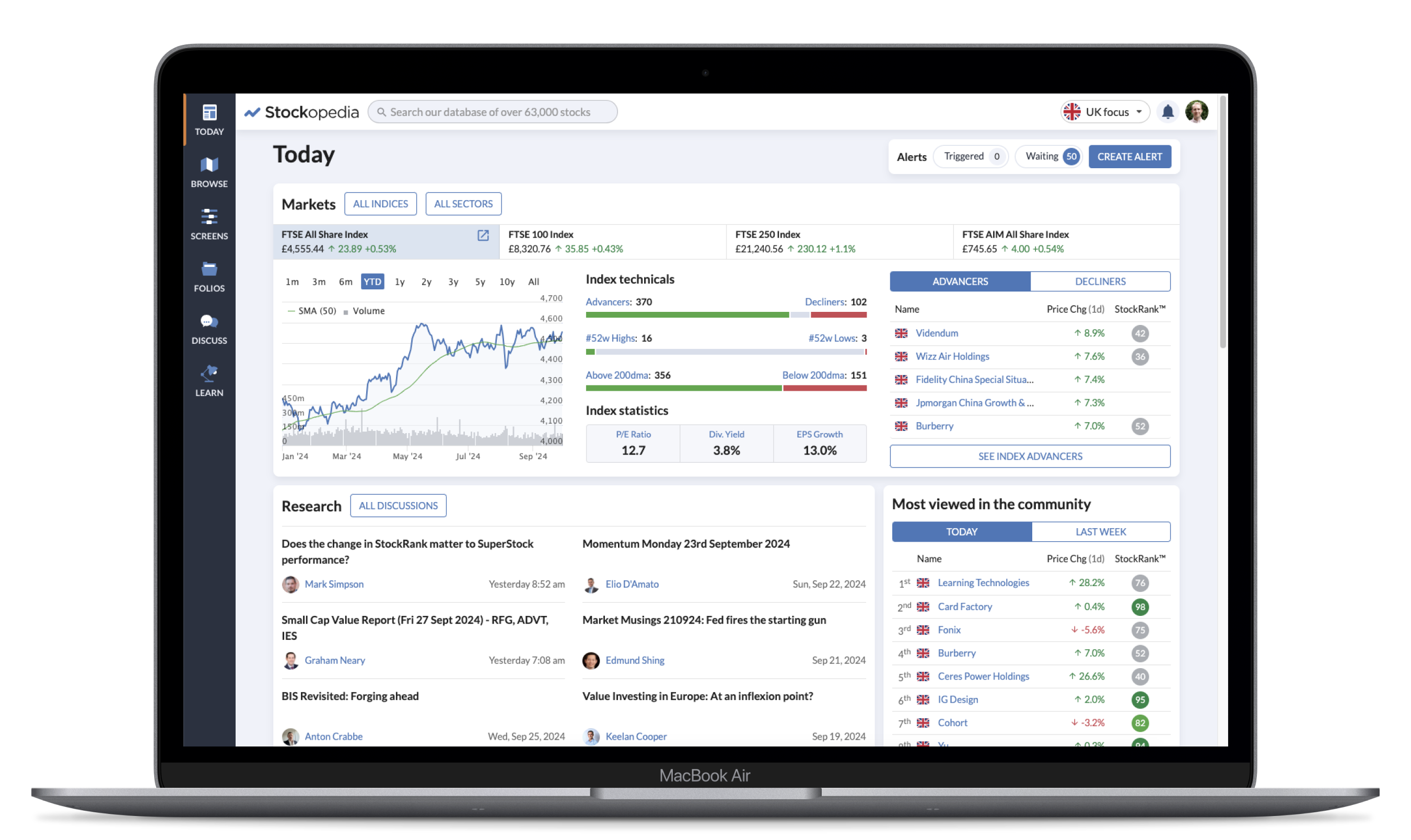
The redesigned Today page on desktop.
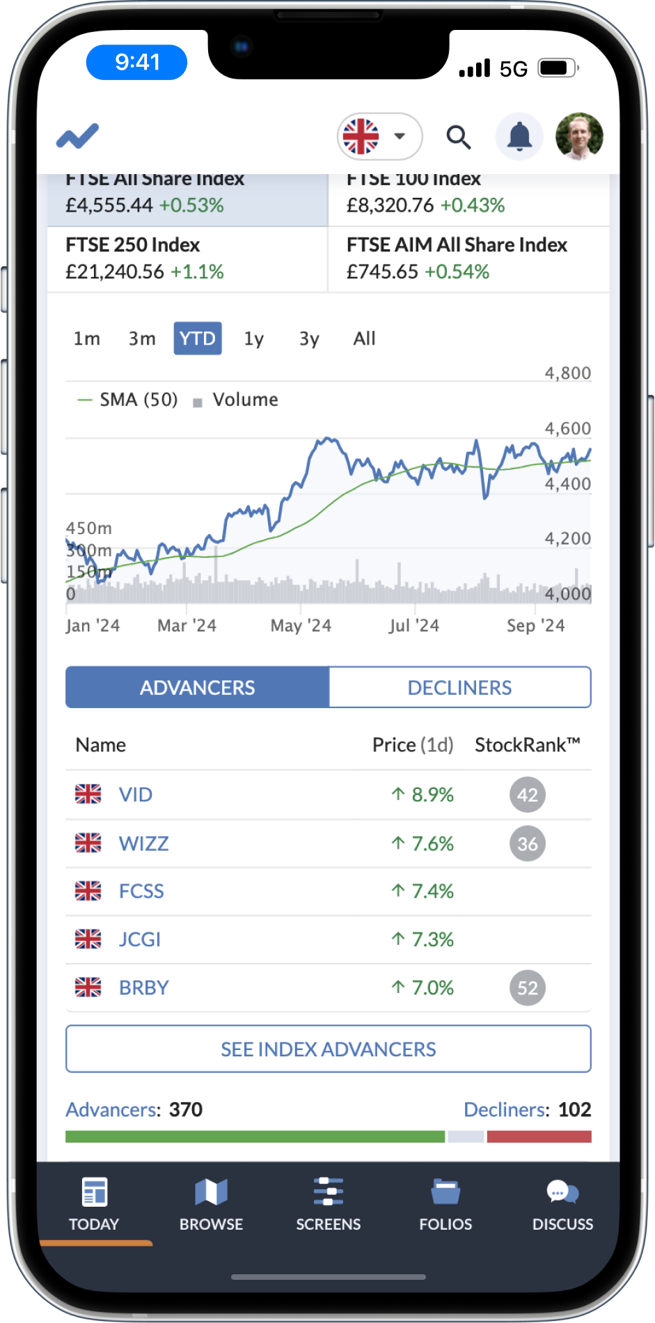
The Today page on mobile.
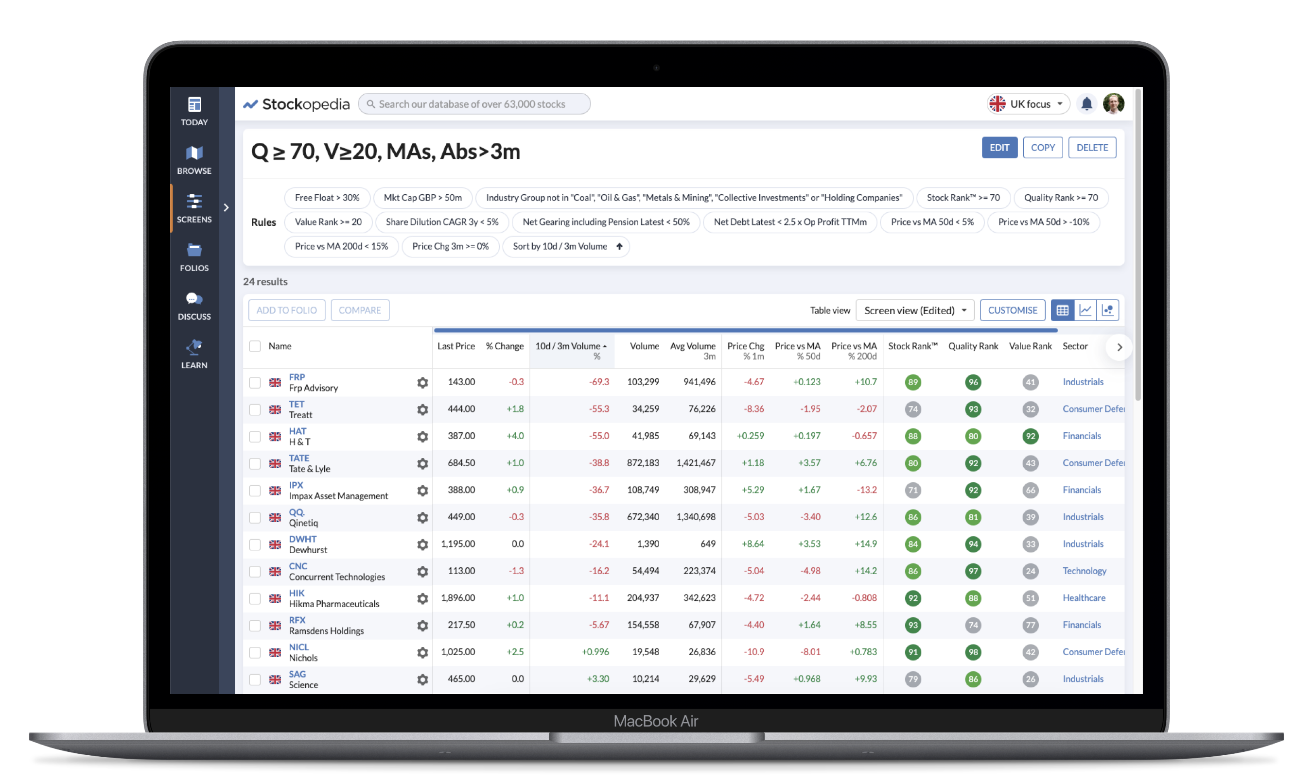
The Screens page on desktop.
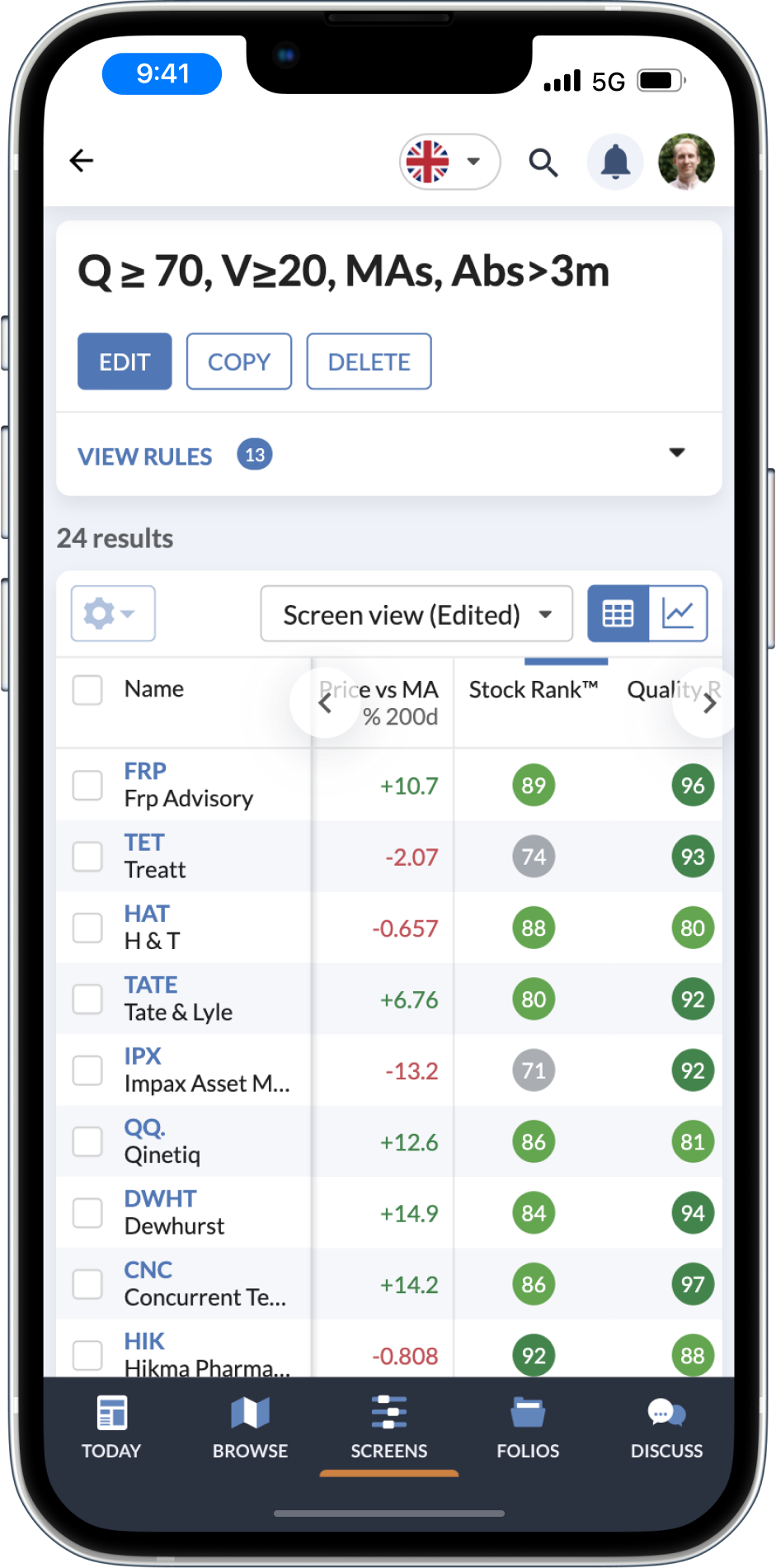
The Screens page on mobile.
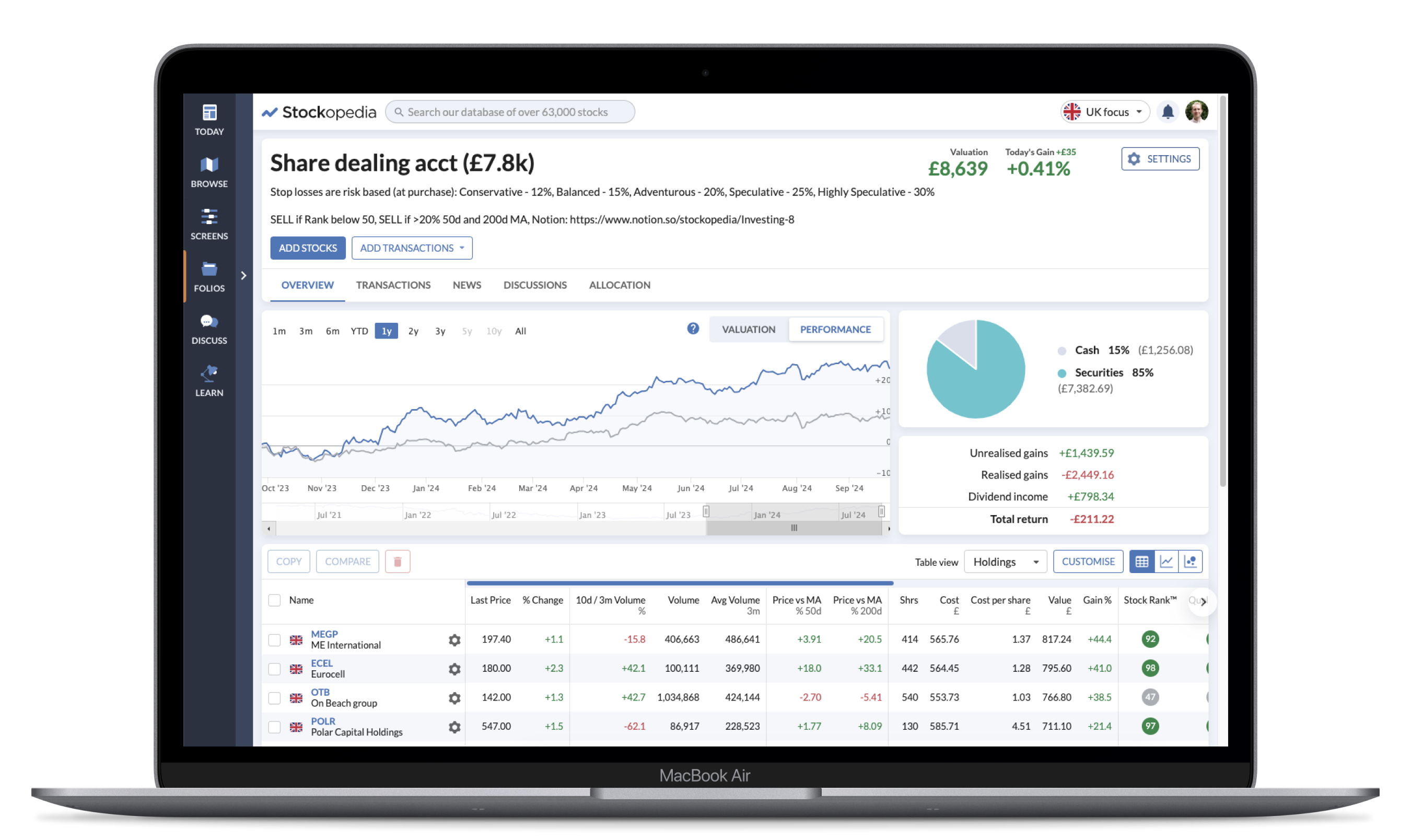
The redesigned Folios page on desktop.
The Folios page on mobile.